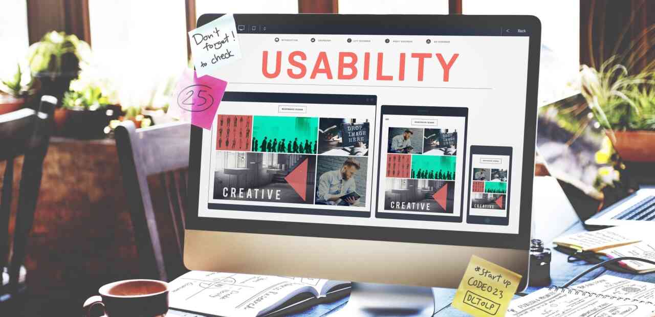
Web usability is a broad category that spans content, organization, technical development, design, and the integration of all of these components. But at its core, web usability is fundamentally linked to SEO.
Why?
The entire set up of search engines is to create a positive user experience: namely, that searchers get answers to the questions and solutions to their problems.
Consequently, it’s not a huge leap to understand that an individual
website’s SEO will be stronger if the usability (and hence, user
experience) of a website is stronger.
Tips for Web Usability and SEO
So from a practical perspective, how can you improve your web usability and SEO given the current digital landscape?
Tip 1: Make sure that your site speed is on par with the industry. This is not only important because a slow site speed (especially if it’s slow compared to competitors’ sites or website norms) is frustrating for your potential customers. Google considers site speed as a ranking factor. So it’s worth the effort and investment on the back end to keep a good site speed.
Tip 2: Prioritize the mobile experience of your audience. Know your visitor behavior. Check your analytics. Are your visitors on mobile? This is especially important now with Google’s mobile-first indexing. So if you don’t have your mobile game in order, it will be difficult for potential customers to search your site on their phones, and Google won’t be inclined to direct them to your site. Double bummer.
A very practical way to provide a positive mobile experience is to implement responsive web designs. This should include flexible text and images; making the information flow clearly and logically, whether you’re viewing the content on a phone, tablet or desktop; and tending to any issues that impede mobile load times. Mobile speed needs to be super fast.
Tip 3: Provide relevant and authoritative content. A website that has helpful, relevant content, is the definition of “usable” to your audience. So make sure that you have content that answers your audience’s most pressing questions, is in-depth enough to explain what your audience needs to know (long form content is often a good thing!), and is written by someone who knows what she is talking about (searchers AND search engines care about the authority and expertise of the author).
Tip 4: Organize your website logically and make it easy to navigate. No one likes blindly shuffling through information to find what they need. People don’t like it, and search engine bots don’t like it. Some easy ways you can improve the organization on your website are:
- Use tags for images and headings. This helps readers get helpful information, even if a page isn’t loading. It also provides helpful context to bots. A good rule of thumb is to only use on H1 tag per page. Don’t include sidebars, top headers, or footers in your hierarchy of tags.
- Create clear navigation through tabs, headers, footers, and on-page signals.
- Within a page, you can use white space and visual clues such as sub-heads to make the organization of information more clear to a reader.
- Make sure the language you use to direct your audience (think CTA, tab names, buttons, etc.) is clear and understandable.
Tip 5: Use internal linking to provide a helpful experience to the reader. Internal linking can help someone get to more specific information, find related information, and get more directly to where they need to go. In short, it makes your website waaaaaay more usable. Here are some good best practices to use in internal linking:
- Link to important things from your home page. Your home page carries a lot of weight (both with search engines and users), so you want to use the links on your homepage carefully. Everything you link to from your home page will be seen as important.
- Link text in content whenever possible. This provides more context to both your audience and bots crawling your site.
- Use links in navigation bars and menus to provide visibility to important pages.
- Avoid generic anchor text like “read more.” This doesn’t help anyone learn what they would be traveling to if they click on that link. The more specific the text, the better.
Tip 6: Use images to your advantage. I won’t go into a large amount of detail here, but simple details like using the file type that best supports the type of image you’re displaying, naming images well, and making sure large files don’t impede loading times can provide a better experience to users.
The bottom line is this: Make decisions on your website that increase the usability for your audience. Ultimately, that’s what both people and search engines (working on behalf of people) are looking for.


