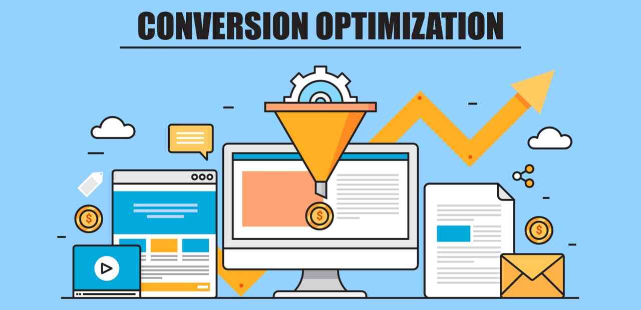
Do you want a performing website that speaks to your business' bottom line? Yes, web traffic and readership are valuable – it is reaffirming to know your website and your company are gaining the exposure they deserve.
However, a lead remains a lead until it is converted into a sale, and only sales garner revenue. Your salesforce is elite at converting leads by phone and in person. Your presentations are interactive, your personnel are charismatic – but how is your website performing in garnering conversion? Review these 7 tips for website conversion to determine where improvements are needed for your business' web site:
Guide User Eye Flow
Guide your user’s focus on the one action you really want them to take. If you want all of your customers to request a free estimate, all roads should lead to that action with a concise function for doing so. If purchasing your eBook is the goal, it had better be available in every format and significantly displayed on each relevant page.
Positioning your Call-To-Action (CTA) within a natural eye path for easy and consistent findability is also important. Don’t confuse your user with multiple CTAs. Keep your site landing pages simple, clear, consistent, and intuitive for guiding your audience to one specific Call-To-Action.
Coupling with Consistency
Consistency on a website eases friction! Consistency will ease the user experience and offer them a sense of comfort. If they know where things are and can confidently navigate with ease, it will provide a ‘stickier’ user experience on your site.
Avoid user confusion in page designs that don’t match in architecture or navigation. Keep page design and navigation consistent.
Align and position your call-to-action in consistent places. For instance if your site is for lead generation, placing the form to the right of the page content can be an advantageous placement for reader eye path (we read Left-to-Right). If that lead gen form is placed the same on every page, the user will never have to search, be lost or confused looking for the form.
In the same fashion, having a 'sticky' CTA can follow the user when they scroll - whatever the device.
Delivering & Satisfying the ‘What’s In It For Me’ Question?
The look, feel, and use of your website should fit the intent of your customer. Attitudes, moods, and rhetoric should line up to create an experience that is visitor-oriented, rather than oriented to your own business alone.
Everyone uses search and lands on a website to do one thing: fulfill what THEY are looking for. When clicking on a site, users are consciously (and/or subconsciously) asking themselves, ‘what’s in it for me’? Does this site have what I am looking for? Does this site satisfy MY need? Can I find what I want/need fast? Is it easy to find? How will this site benefit me?
Businesses should stop talking about themselves on their websites. Users don’t really care. Businesses need to know their target audience and what they can do to satisfy the question their audience is asking themselves, ‘What’s In It For ME’. Turning your sights on your user, will move your business towards having a more conversion-centered site.
Congruence
Like consistency, coupling with congruence, the user experience will have a subconscious (and/or conscious) sense of security. Be sure your logo, brand expressions, site architecture, navigation are displayed and consistent throughout your entire website to make the customer feel comfortable and settled into your website from page to page. Familiarity begets loyalty.
Clarity
Nothing destroys a low bounce rating like a confusing website. Customers do not want to excavate to find their desired information. Keep contact information, product specs, and any other useful information available, and streamline navigation for maximum conversion opportunity. Your page should effectively direct eye flow to the Call-To-Action by studying best rules of practice, site analytics, in-page eye tracking and click-thrus and then adjusting accordingly.
Credibility & Trust
Be transparent. Offer verifiable, measured product details and a specific breakdown of services on your site. Be sure your site's UX inspires trust from customers by hiding nothing and avoiding cryptic language or exaggeration.
Include contact information, phone numbers, ‘about us’, mission statement pages along with credibility and trust icons like BBB Accredited Business, secure shopping icons, HTTPS, etc.
Research & Continuance
One conversion can be responsible for multiple leads. Researching and studying site analytics can help you see what is working and where you need to streamline (or tweak) to continue with higher returns.
Maintain the flow by encouraging referrals through promos for current customers, loyalty and rewards programs, and an obvious display for social media sharing.
In Summary:
Developing a conversion-centered website requires thought, strategy, research, and ongoing tweaking. The elements listed here are a good starting point for improved conversion optimization. But before you can begin implementing these factors, it’s important to research and KNOW your target audience. Only then can you fulfill what your user wants and/or needs from your website.


